.jpg)
The UX Designer's (Complete Yet Concise) Guide to Accessibility
When I first started designing accessible experiences I struggled to find clearly listed standards to follow (or should I say, easily accessible standards 😉). So now that I've become versed and more experienced in accessibility, I'd like this article to be a clear reference - i.e. what I wish I could've found when I was learning.
Text
Have enough contrast for legibility
W3 standards require standard text to have a contrast ratio of at least 4.5:1, but nobody want to do that math on that. I'd recommend using a free tool instead.
Make links clear
The global indication of a link is an underline, but there are additional methods for visualizing links. Making sure links look like links is important regardless of the means. But part of this is also writing clear link text so the user has a proper understanding of what clicking the link will do.
Never rasterize text
Rasterizing here means is converting text into an image format. Often mediocre marketing tactics will include placing a graphic onto a page with words on it that could be coded (as an example). This prevents the text from wrapping responsively, being readable accessibility tools, and rendering clearly at different screen sizes.
Keep text big enough
I've found this rule to be the most difficult to follow. For instance, field labels look bizarre at 16pt. So how you incorporate this is up to your judgment given your users, their devices, and your priority of visual balance and accessibility. But the general rule is that you're super safe if your text is 16pt or larger (assuming good contrast). The contrast tool linked to earlier can help with this rule as well.
Make text layouts easy to scan
There are a few things to keep in check here:
- Paragraph text never stretches wider than 760px.
- Never justify text
- Line spacing on paragraphs of at least 150% but also not excessive.
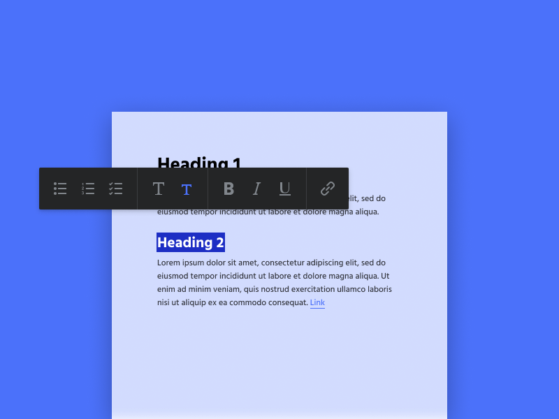
Break up content with headings
Sections of content should be labeled with headings, but there should be a validation that the hierarchy of headings is being used correctly. Utilizing different levels of headings (H1-H6) to make the content tree clear is important.
.png)
Forms
While there are exceptions to some of these rules (e.g. natural language forms or some single-field forms), these rules are always very important:
Label fields
Input fields need descriptive labels that remain visible during input. Icon labels can be okay if they're universally recognized (e.g. email, phone), but they should have alt text.
Show input requirements & errors
Some fields have very specific requirements. Passwords require a capital letter, a text thread has a character limit, etc. These have to be communicated to the user, and the form should let them know if there are errors or successes on these fields.
But don't rely on color to demonstrate different states (red for warning, green for success, etc.) - many people are at least partially colorblind. Pair colors with icons or descriptive text.
Stack fields vertically
It's much harder to scan or keep track of your place on a form that flow smoothly from top to bottom. Input fields should be stacked vertically unless they explicitly flow together (city, state, ZIP for instance).
Use an asterisk to denote required fields
Putting an asterisk beside a field label has become universal language for "required". Best practice is put the asterisk to the left of the label text
Clarify the submission button
Often the lines blur between accessibility and just good UX. And, frankly, that's okay. Accessibility doesn't have to mean a better experience only for handicapped people, it can simply mean a good experience for everyone. Being clear with a form's submission button is one such case - poor labeling may be especially difficult for some people, but it certainly helps everyone.
Respond to submissions
Once a person has submitted a form it's important to indicate that information was received and the system responded to their submission.
.png)
Media
Summarize message of images
Infographics and graphs or other detailed images can't be read by someone with vision limitations, nor can they be read by screen readers. So the best way to communicate these images to those people is to provide a text summary of the image content adjacent the image.
Transcribe or caption media
If a video or audio track is being highlighted there should be a transcript or summary. Videos should have caption. While it isn't always your prerogative as a designer to transcribe audio or caption video, you do have the ability to design a layout or feature to accommodate that option.

Layout
Space elements contextually
Related items should be close together. This is just good user experience, but many people have tunnel vision and struggle to use their peripheral which makes this additionally important.
Design for device responsiveness
Designers typically design for multiple screen sizes in this era, but designing for accessibility means that layout is responsive even at high zoom.
Be consistent
Certain handicaps make it harder to quickly recognize changes and adapt. For your platform to be accessible you should be designing with UX patterns in place that stay consistent across the experience.
General
Make click points large enough
Rule of thumb: give click points (buttons, links, or anything else that's interacted with) at least 40px of active area in each direction. This means an imprecise mouse pointer or a large finger won't have trouble pressing the right point.
Don't auto-play sliders
Sliders that automatically transition are not only annoying to everyone, they're especially difficult for people with accessible needs. It's hard to finishing reading sliders that transition without permission, and those sorts of experiences that take control away from the user and put a roadblock up should be avoided.
Give modals titles
Titles are hugely important for people relying on screen readers. As with many other accessibility rules, adding titles to modals provides clarity to anyone, but especially to people with challenges.
Make interactions and transitions comfortable
Basic use like text input, hover, or page navigation shouldn't trigger radical changes e.g. (layout changes, pop-up modals, auto-scrolling). Interactions should feel fairly predictable rather than jarring.
Bonus points
- Design for variations (right-to-left, longer words, characters, etc.) if your platform will be viewed in multiple languages.
- Use semantic markup in code.
- Code graphs and infographics whenever possible.
- Order layout in code so that keyboard navigation or screen readers are able to navigate content in the correct sequence.
- Ensure that navigating elements (links, buttons, etc.) are coded with active (focused) states for ease of use when navigating with the keyboard.